Amazon Review Strategy: Product Inserts Analysis: Real-Life Examples | Part 2
In our blog about using Product Inserts as part of the Amazon review strategy, we wrote about the theory that goes into packaging inserts. This time around, we’ll provide you with some real-life examples, and we’ll examine them to determine the good and the bad so that you can incorporate the best practices into your own product inserts. Clearly, we removed the brand names and logos to maintain their identity.
Use these as examples and BellaVix comments to come up with your own! Don’t be afraid to experiment; create inserts with different goals in mind to see which ones give the best results.
Before we do a deep dive, just a short recap of the main components of product inserts:
- Stick to the rules ( Read the Customer product reviews policies on Amazon help pages)
- Remind customers of why they purchased your product (highlight the benefits)
- Request that they leave a review and include instructions on how to do so.
- Maintain a simple, easy-to-read, and brand-consistent design.

Example 1:
-
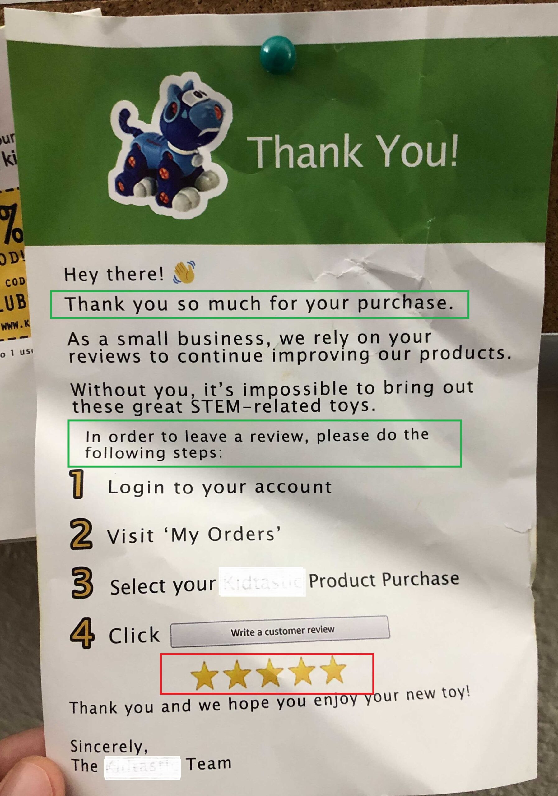
- Thanking the customer for purchase: makes them feel special ✓
- Including instructions on how to leave reviews ✓
- Borderline: Included a 5-star rating – might be leading the customer to leave a positive review X
- Clearly instructing buyers to leave a review on Amazon if they are happy, and if they are not, they are directing customers off Amazon. This is against Amazon’s TOS X
- Directing customers off Amazon, by including their website: (X) although this is a grey area: given that they also provide an extended warranty if customers register (✓)
- If the placement was different, that is, not to include website/extended warranty along with saying reach out to us directly (not with a review on Amazon) if there are any issues: bonus and the website would be ok to use


Example 2:
-
- This is an example where the sole purpose of the insert is to provide a value-add to the customer without asking anything in return. ✓
- Due to this, including the website for registering is perfectly alright ✓
- It contains a QR code that directly leads the customer to the register page, so they made it very easy for the customers: great customer experience ✓
- Off Amazon customer service email: at the back of the flyer and when asking for a review: although not directly stated, it implies, if you’re happy to leave a review, if you’re not: reach out to us off Amazon X
- Includes value adds, such as care instructions and how to use ✓
- It asks for an Amazon review neutrally, and it includes instructions on how to do it ✓
- Includes a cross-sell feature by highlighting other products ✓
- Overwhelming for the customer includes all the goals (benefits, how to use, asking for a review, giving a warranty, discounts for the next purchase, bestseller, etc.) X
- If we look at this brand’s insert, segment by segment, it does contain some great value-adds, useful information, discounts, and so on, and in 90% of the times, they are compliant with the terms, however, packing all of the goals into one insert is overkill- and in cases, actually breaking the rules because, for example, they offer a discount on the next purchase and ask for a review X
- This would be a great example for split testing the insert and identifying which one is best performing and which value adds customers appreciate the most. ✓


Example 3:
-
- Simple, effective design ✓
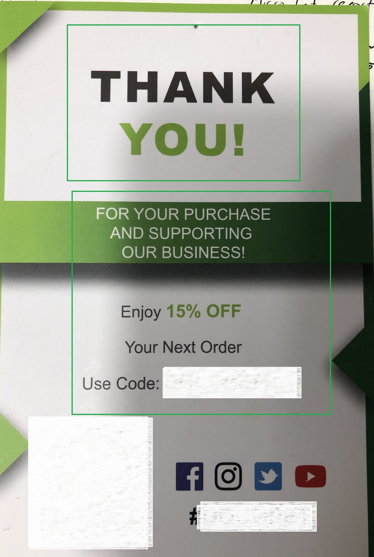
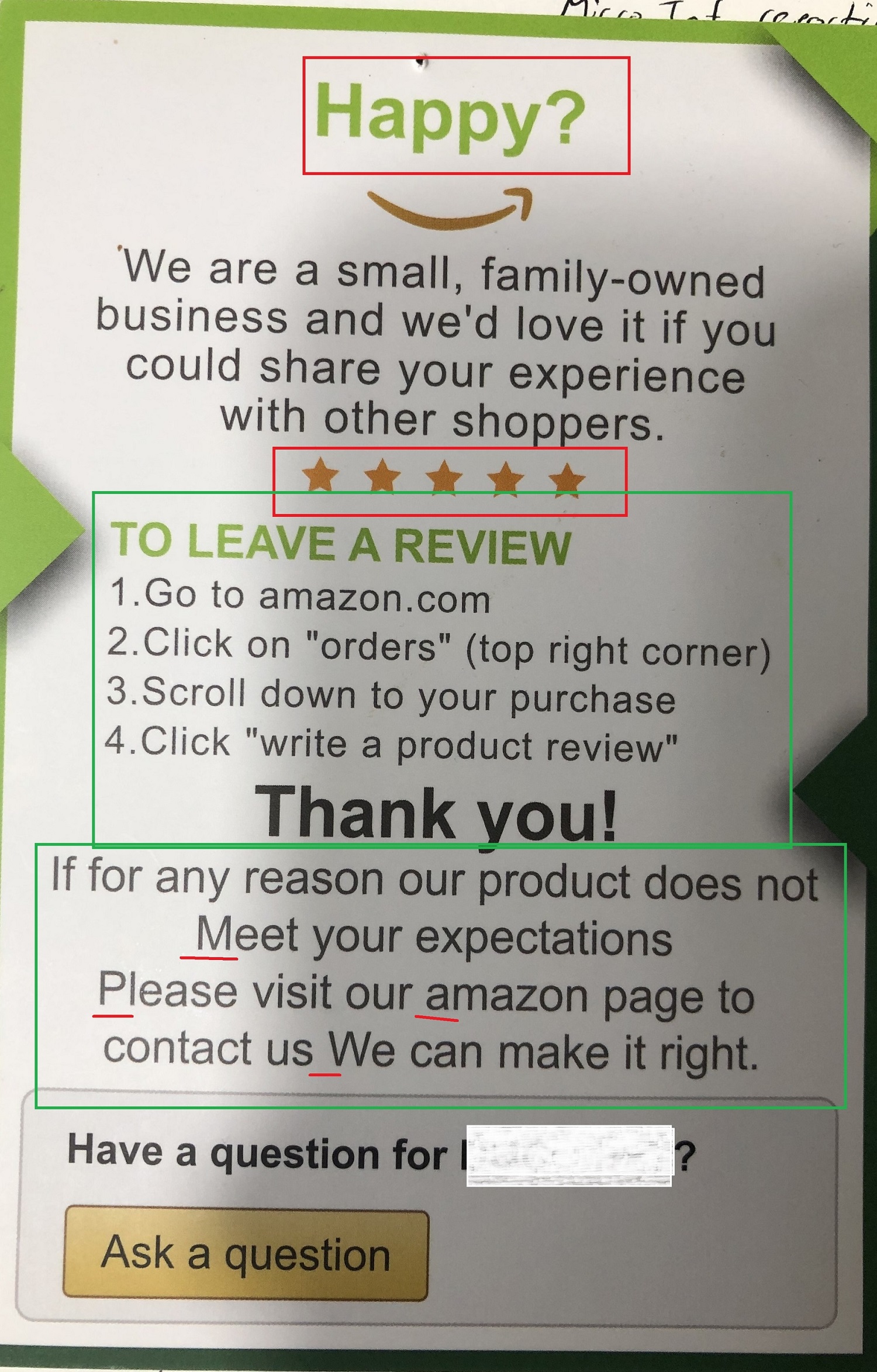
- Grey Area: Although discounts and asking for a review are on the same insert, they are not breaking the rules per se, as the discount does not apply only if the customer leaves a review
- Leading the witness, by including the 5-star rating and “Happy?” question: this can be completely omitted, and the same message would be preserved and conveyed X
- Driving customers to Amazon customer service in case of any issues ✓
- Includes instructions on how to leave a review ✓
- Use of capitalization wrong, no full stops, etc. X

Example 4:
-
- Simple design ✓
- Shows the brands catalog via images ✓
- Offers exclusive warranty: makes the customer feel special. ✓

Example 5:
-
- This is an intriguing product insert because it’s giving away almost a free product without asking anything in return (officially) ✓
- We can conclude that they are building a customer subscriber base to target them with the newsletters and offers directly down the road.
- Directing customers to email them off Amazon in this sense is most definitely against the TOS X.

In Conclusion:
As you can see, all of the inserts have something that is against Amazon’s TOS and, truth be told, and Amazon is not going to be the bad cop here and chase you and examine your product inserts. But if someone, for example, your competitor, reports you, and Amazon catches you, the consequences can be great, and they are not worth it.
Hopefully, you will find this analysis useful so you can put some thoughts and effort into designing your own product insert. If you have additional questions or want us to help you on your Amazon journey, don’t hesitate to contact the BellaVix Team.
Keep up with the latest Amazon and Walmart news updates and subscribe to our BellaVix newsletter 👇👇👇


